
You build the deck on a good monitor in a quiet office. Black background, crisp white type, one bright accent. It looks expensive. Then you present it in a meeting room with the blinds open and the lights on, through whatever projector is bolted to the ceiling. The black is now gray. The thin labels are gone. The chart that looked sharp this morning has turned into a smudge.
Nothing is wrong with dark slides. We like them, and our own brand is built on black. But a dark deck is a bet on the room, and it’s a bet many people make without knowing it. This guide explains why dark slides fade, how to choose between dark and light, what to change if you go dark, and how to build a deck so you can switch when the room turns out to be different from what you expected.
Why dark slides fade in a bright room
A projector can add light to a screen. It can’t take any away. Where your slide is white, the projector pours light onto the screen. Where it’s black, it sends almost nothing, so what you’re looking at is the bare screen, lit by whatever light is already in the room. “Black” on a projected slide is just the color of the screen under the room’s lights.
That’s why the same projector can look great in one room and weak in another. Here’s a simple illustration. Say the projector adds 100 units of light. In a dim room, the room adds 2 more. White is 102 units, black is 2, and the contrast between them is 51:1. Now turn the lights on, so the room adds 30. White is 130, black is 30, and the contrast falls to about 4.3:1. It’s the same projector and the same slide, with roughly a twelfth of the contrast.
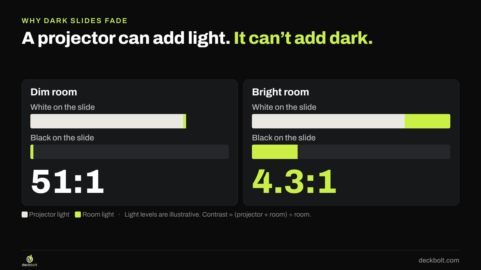
That loss applies to light slides too. The difference is what it does to the slide. On a light slide the large area stays bright, and dark text still reads clearly against it. On a dark slide the large area is the part that turns gray, and that’s the part everyone sees as washed out. Thin, pale details on top of it fade quickly.
TVs and LED walls make their own image, so they don’t work this way. Their blacks stay much darker, though glare from windows and lights can still hurt.
Pick for the room, not your taste
The useful question isn’t “which looks better?” It’s “where will this be seen?” Here’s a sensible starting point for each situation.

- Stage with the lights down: dark usually works well. A full white slide in a dim room can feel like opening a fridge at night, and it can make the speaker harder to see.
- Meeting room projector, lights on: start with light.
- Boardroom with a big TV: either can work, so test both. Check for reflections from windows.
- Video call: you can’t control anyone’s screen, so test both. Our guide to presenting on a video call covers what matters more than background color.
- PDF sent ahead: test both on a laptop and on a phone, ideally somewhere bright.
- Printed handout: use light. Full-page dark slides use a lot of ink and often print muddy on office printers.
If you don’t know the room, light is the safer default, because it survives both bright rooms and printers. If the look of the deck really matters, ask to see the room first, or at least find out what screen it has and who controls the lights.
Going dark? Thicken everything thin
If you do choose dark, the deck needs some work. Details that look elegant on your monitor are the first things to go when room light gets involved, so give them a margin of safety.

Text
Use Regular or Medium weight, not Light or Thin, especially for small text like labels and sources. Keep your type sizes simple and a step larger than you’d use on a light slide if the room is big.
Grays
Mid-gray is the classic trap. A gray like #7A7A78 on near-black measures about 4.5:1, so it looks acceptable on a monitor. Add room light and that margin disappears. Use a brighter gray for anything people need to read.
Lines
Hairlines vanish first. Make chart lines 2–3 pt, keep gridlines quiet or remove them, and check that the main point still stands out when you step back from the screen.
Retune your chart colors
Colors chosen for a white background rarely carry over. A navy like #1F3A8A measures 10.3:1 on white, which is excellent. Put the same navy on near-black and it falls to 1.9:1, so the bars almost disappear. A lighter tint of the same blue, #8FB0FF, reaches 9.0:1 on the same background.

Give the dark version its own chart colors rather than reusing the light ones, and check each one against the background with a free contrast checker. Web accessibility guidelines ask for at least 3:1 for graphics, and that’s a reasonable floor for a chart. Aim higher if you know the room is bright. Also keep to the same discipline as any good chart: one accent for the point, quiet gray for everything else.
Check logos, screenshots and photos
Images bring their own background with them. On a dark slide, a logo saved on white shows up as a white box. Ask for the reversed version of the logo as a PNG or SVG with no background, and check that it’s approved for dark backgrounds.
Screenshots are a bigger problem. A full white app screen on a dark slide glows like a flashlight, and it pulls every eye away from your message. Crop tightly to the part that matters. If the product has a dark view, use it. Otherwise, consider giving that one section a light background so the slide feels planned.
Build one theme, get two versions
The best protection is a deck that can change its mind. If every color comes from the theme, you can switch between dark and light in minutes instead of recoloring slide by slide. The same approach makes a template your team will actually use.
- Use theme colors for text, shapes and charts. Anything colored by hand won’t switch.
- In PowerPoint, go to Design → Variants → Background Styles to swap the background, or Design → Variants → Colors → Customize Colors to edit the palette.
- In Google Slides, go to Slide → Edit theme, then change the theme’s background and text colors.
- Save the second version as its own file, so you can pick on the day.
- Go through every chart and logo. They’re usually the first things to break when you switch.
A worked example: same slide, same bright room
Take a simple slide titled “Online is now our largest channel”, with four bars for the share of Q3 sales by channel. On a monitor, the dark version looks great: lime bar, charcoal bars, small gray labels.
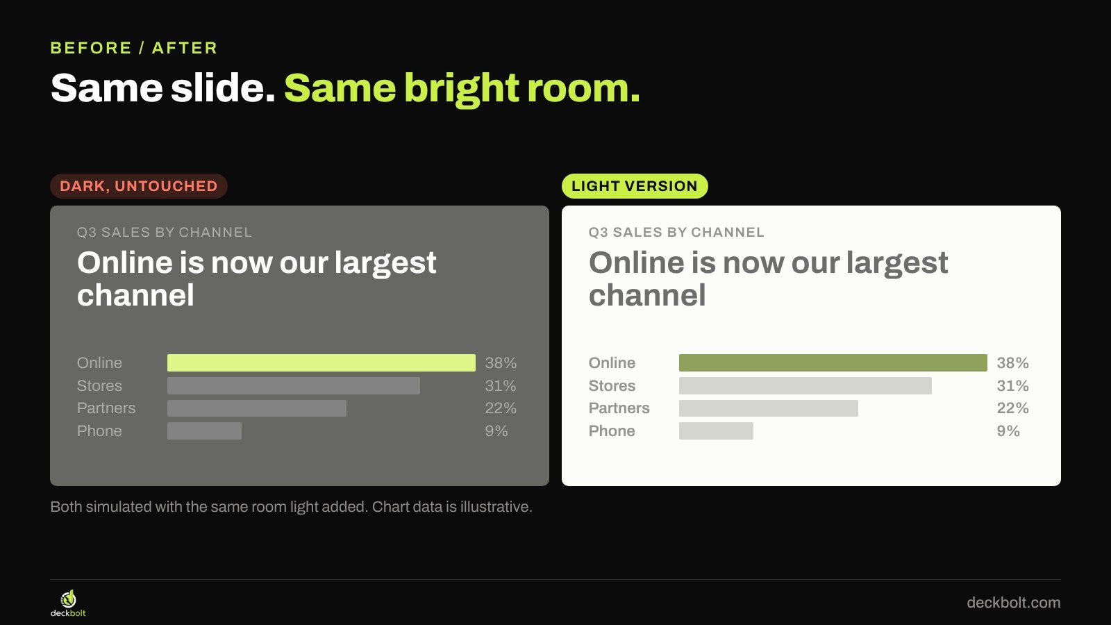
Add the same room light to both versions. The dark one loses its depth, and the background turns gray. The small labels and charcoal bars sink into it. The light version has the same content in the same room, and every label still reads. Neither design changed the message. One of them just suited the room.
If the dark version has to stay, because it’s the brand or the event’s style, then the fixes above are what rescue it: heavier labels, brighter grays and lighter bars. And if you can, close the blinds.
How to test it in the real room
A few minutes in the room beat an hour of guessing. Before the day, put three slides on the real screen: your busiest chart, your smallest text and a slide with an image. Set the lights the way they’ll be for the meeting, then walk to the back row and ask yourself four things:
- Can you read the smallest label from here?
- Can you tell every chart color apart?
- Does the background look intended, or just gray?
- Do the logo and screenshots sit cleanly on it?
If you can’t get into the room, ask someone who can to send a phone photo of a test slide on the screen with the lights on. It won’t be exact, but it will tell you whether you’re dealing with a bright room or a dim one.
Common mistakes
- Judging the deck on your own monitor. Your screen is usually the best one it will ever appear on.
- Copying the look of a keynote. Those stages have controlled lighting and a very large, very bright screen. Your meeting room may not.
- Assuming dark always looks more premium. A clean light slide in the right room looks better than a washed-out dark one.
- Testing with the lights off. Check the slides in the lighting you’ll really have.
- Forgetting the handout. If people will print it, keep a light version ready.
A short checklist before you pick dark
- Do you know the room, and who controls the lights?
- Is your smallest text still Regular weight or heavier?
- Do chart colors reach at least 3:1 against the background?
- Do logos and screenshots sit cleanly on it?
- Have you seen it on the real screen, from the back of the room?
The chart data in this article is illustrative, and the room-light images are simulations. Contrast ratios for the colors shown were calculated with the WCAG formula.
Not sure how your slides will hold up where they’ll really be seen? Request a free deck review and we’ll take a look.