
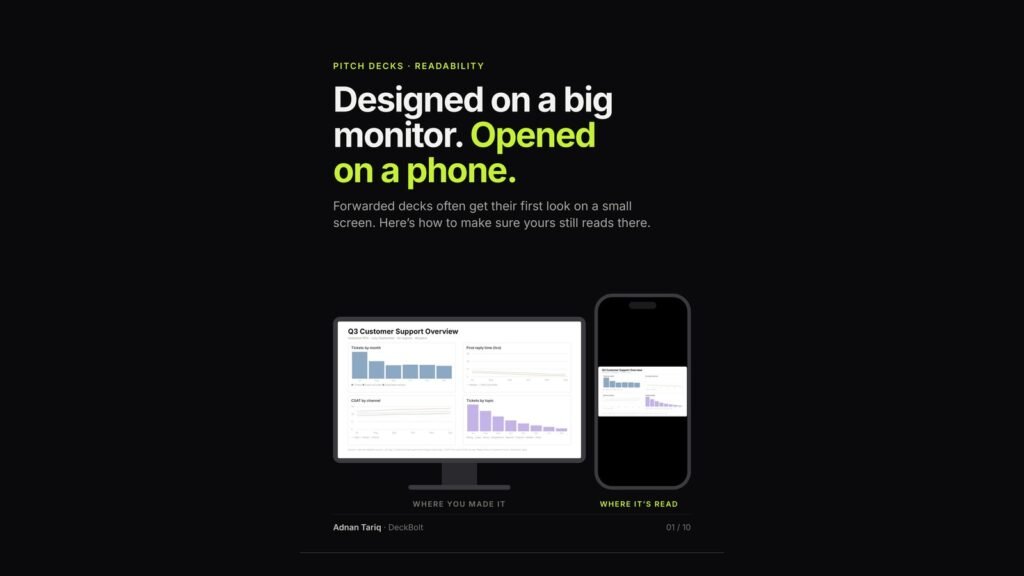
You build a deck on a big monitor. The person you send it to often opens it on a phone, especially when it has been forwarded. Here is how to make sure yours still reads on a small screen.
How small is small?
A PowerPoint widescreen slide is built 13.33 inches wide. A typical phone shows a 16:9 slide only as wide as its screen: about 4.5 inches held sideways (around a third of the size) and about 2.6 inches held upright (around a fifth). These figures are approximate, for a typical 6.1-inch phone.
Upright, the headline and big numbers survive. Sideways, body text survives, if it is big enough.
What breaks first
On a small screen, the details go first:
- Sources and footnotes. Tiny grey text turns into a smudge.
- Axis labels and legends. Readers cannot match colours to names.
- Thin lines and light grey. Hairlines fade into the background.
- Text over photos. Thin type gets lost in the image.
Rule 1: If they read one line, make it the headline
Held upright, the headline is often the only line that reads. Write the point, not the topic. “Q3 Support Update” tells them nothing. “Support tickets fell by half after the help center launched” tells the whole story at a glance.
Rule 2: Set a size floor, and nothing goes below it
A rule of thumb for PowerPoint’s 13.33-inch widescreen slide:
- Headlines: 28 pt or more, ideally 32–44 pt.
- Body text: 18 pt or more, one idea per line.
- Chart labels: 14 pt or more, for axes, data and callouts.
- Sources and footnotes: 12 pt minimum. These can need a zoom.
Anything below 12 pt: cut it, or move it to the notes or the appendix. Google Slides’ default page is 10 inches wide, so multiply by 0.75 (headlines 21 pt, body 13.5 pt, sources 9 pt).
Rule 3: Thicken the lines and label the data directly
Use 2–3 pt lines and darker text. Put each name at the end of its line, so nobody has to match colours to a legend. Hairlines, pale labels and a legend at the bottom disappear on a phone. Thick lines, one series in focus and names on the data do not.
Rule 4: Split the dense slide
A four-chart slide makes a phone reader pinch and pan. Four one-chart slides just need a swipe. Pages are free: a longer PDF costs nothing, but an unreadable slide costs you the point. Give each slide a title that states its point, and someone who skims only the four headlines still gets the story.
Run the phone test before you hit send
- Export: save the deck as a PDF.
- Send: open it on your own phone.
- Read: upright first, then sideways.
- Flag: every slide you had to zoom.
It passes when, upright, every headline reads and states the point; sideways, body text reads without zooming; chart lines, labels and numbers are easy to see; and no slide needs a pinch to make sense. Sources can need a zoom. Your point cannot.
For more on what happens once your deck leaves your hands, see Your Pitch Deck Gets Forwarded. You Don’t.
Want a second pair of eyes on your deck? Send it over for a free deck review. We will read it the way investors and clients will, on a big screen and on a phone, and tell you what to fix first. Request a free deck review.
Want this done for you? See our pitch deck design services.