
Here is a test you can run on any slide in five seconds. Squint at it until the words blur. What still stands out is what people will read first.
If the answer is “everything”, the slide has no hierarchy. And if everything on your slide is bold, nothing is.
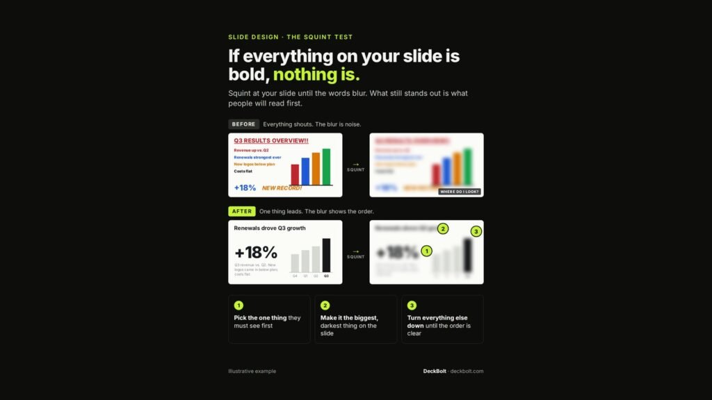
Before: everything shouts, so the blur is noise
In the illustrative “Q3 RESULTS OVERVIEW!!” slide, the title is in red capitals and underlined. Each of the four bullets is a different colour. The chart has four brightly coloured bars. “+18%” is large and blue, and “NEW RECORD!” is orange and italic.
Squint at it and you get a blur of competing colours. The honest reaction is: where do I look?
After: one thing leads, and the blur shows the order
The rebuilt slide has a plain headline, “Renewals drove Q3 growth”. The “+18%” is the largest, darkest element. The chart is muted grey with only the Q3 bar in black, and a short caption explains the context in small grey text.
Squint at this version and the order is obvious:
- The +18% figure
- The headline
- The Q3 bar that proves it
How to fix any slide in three steps
- Pick the one thing they must see first. Usually the number or claim the slide exists to make.
- Make it the biggest, darkest thing on the slide. Size and contrast do the work, not exclamation marks.
- Turn everything else down until the order is clear. Grey, smaller and lighter are your friends.
Then squint again. If the blur now reads in the order you intended, the slide works. For the full method, see Squint at Your Slide: the four levers of visual hierarchy.
The slides described here are an illustrative example.
Want a fresh set of eyes on your slides? Send your deck for a free deck review.