
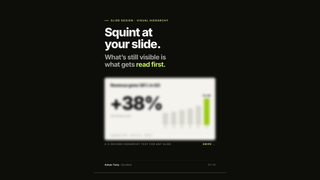
Every slide has a reading order. Size, contrast, position and space decide it, whether you planned it or not. The question is whether the order your audience follows is the one you intended.
The idea: point, proof, details
A well-ordered slide has three levels:
- The point: the one thing to remember. In the illustrative example, a large “+38%” under the headline “Revenue grew 38% in Q3”.
- The proof: why it is true. A bar chart with the Q3 bar highlighted and labelled $2.4M.
- The details: for whoever wants them. A quiet line reading “Customers 1,240 · Churn 2.1% · NPS 61”.
The test: blur it
Squint, step back or zoom out until the words go soft. The shapes that survive are your real hierarchy. (We also show a quick before-and-after in The Squint Test.)
Fail: everything survives
Coloured stat boxes, bordered panels, a rainbow chart and a strip of logos, all at the same weight. Blurred, every block competes to be first. The eye has no first stop.
Pass: one thing survives first
The point lands first. The proof comes second. The details wait until someone needs them. Blurred, the big number is still there, and so is the order.
The four levers that set the order
Pull one hard. Leave the others quiet.
- Size: bigger reads first.
- Contrast: the one that differs reads first.
- Position: top-left reads first in left-to-right languages.
- Space: isolated reads first. Crowds blur together.
The fix: demote before you promote
Most fixes are not a bigger headline. They are everything else getting quieter.
| Element | Instead of | Use |
|---|---|---|
| Labels | Black, bold | Grey, regular |
| Logos | Full colour, large | One tone, smaller |
| Panels | Borders and fills | Whitespace |
| Secondary stats | Four big cards | One quiet line |
| Chart colours | One per bar | Grey plus one highlight |
The point rises when everything around it steps back.
Same content, new order
The “before” slide, titled “Q3 RESULTS”, has four coloured stat cards, a callout box, a multicoloured chart, a bordered bullet list and a coloured logo strip. It reads as no first stop. The “after” slide uses exactly the same content: one point (+38%), one proof (the highlighted Q3 bar) and the details in grey. It reads as point, then proof, then details.
The 5-second check
Run it on every slide before it leaves your laptop:
- Blur the slide. What survives first?
- Is that the one point of this slide?
- Is there only one “first”?
- Can you demote something instead of enlarging something?
- Does the order match what you would say out loud?
Numbers in the examples are illustrative.
Want a second pair of eyes on your slides? Send us your deck for a free deck review. We will run the squint test on it and show you where the reading order breaks.