
Speaking at an event? See our keynote and event presentation design service.
Conference slides are usually designed at a desk. You sit close to a laptop screen, the text looks perfectly readable, the chart looks clear, and the slide feels finished. Then the talk happens in a room where many people sit a long way back, the projector is dimmer than your laptop, and everyone is trying to read your slide and listen to you at the same time.
That gap between the desk and the room is where many good talks lose people. This guide is for anyone preparing slides for a conference, a keynote, a panel, a meetup or a large internal event. It covers why talk slides need different rules from decks you send, six practical fixes, a worked before-and-after, how to set things up in PowerPoint and Google Slides, and a checklist to run before you go on stage.

A deck you send and a deck you present are different decks
A deck you email is read alone, at the reader’s own pace, close up. If something is unclear they can go back and read it again. It has to carry the whole argument in writing, because you are not there to explain it.
Talk slides work the other way around. They are seen together, at your pace, from across a room, usually once, while you are speaking. You carry the argument; the slides support it.
The trouble starts when one file tries to do both jobs. Slides written to be read are full of sentences. Put those sentences on a big screen and the audience does what people naturally do with text: they read it. While they read, they are not really listening, and when they have finished reading, they wait for you to catch up. Your slides end up competing with you.
So the first decision is simple: if you also need a version to send afterwards, make it a separate file. The stage version can then be built for the room.
Fix 1: Run the back-row test
Before the event, show each slide at about a quarter of its normal size on your screen and step back a couple of meters. If you can’t read something comfortably, the back row probably can’t either. It’s a rough test, but it catches most problems in a few minutes.
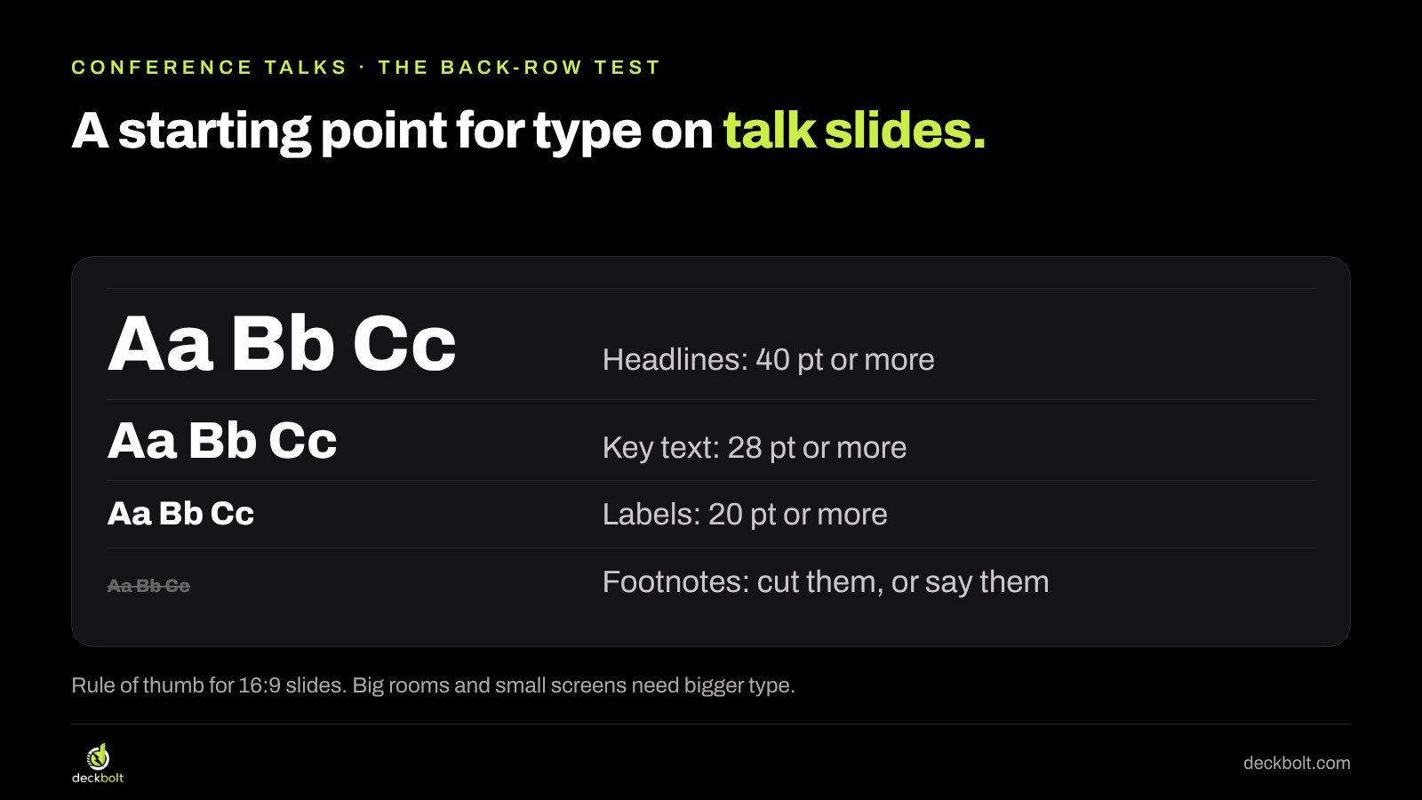
A common starting point for type sizes on a 16:9 slide is headlines of 40 pt or more, key text of 28 pt or more, and labels of at least 20 pt. Treat these as a rule of thumb rather than a law: a huge hall or a small screen needs bigger type, and some fonts read larger than others at the same size.
The test also tells you what to cut. Footnotes, source lines in 10 pt and dense tables almost never pass. If a detail matters, say it out loud or put it in the version you send afterwards.
Fix 2: One idea per slide, and more slides is fine
Many speakers try to keep their slide count low, as if fewer slides meant a shorter or simpler talk. Your talk has a time limit. Your slide count doesn’t. Four slides with one idea each usually feel lighter than one slide with four bullet points that stays on screen for five minutes.
Take a typical “section” slide: a long title, then four bullets about moving support from email to chat, the result, customer satisfaction, and next year’s plans. Split it into four slides: “Email replies took 4 hours.” “We moved support to chat.” “Replies now take 12 minutes.” “Next: two more languages.” Each slide matches one sentence you say, and the audience always knows where you are.
A useful way to plan this is to write your talk as a list of short sentences first. Each sentence that deserves a visual becomes a slide. Sentences that don’t need one can share a slide, or have no slide at all.
Fix 3: Charts for a room, one line and one point
A chart that works on a laptop can turn into a tangle on a projector. Six colored lines, a legend, gridlines and small axis labels ask the audience to decode before they can understand, and they have only the few seconds you spend on that slide.
For a talk, design each chart around the single point you will make while it is on screen:
- Write the point as the title. “Email support fell every year” rather than “Support contacts by channel, 2020–2025”.
- Color only the line you are talking about. Make everything else a quiet gray.
- Label the line directly, at the end of the line, instead of using a legend.
- Remove gridlines and extra series that you won’t mention.
If you need to make two points about the same data, use two slides with the same chart and a different highlight on each.

Fix 4: If you’ll say it, don’t write it on the slide
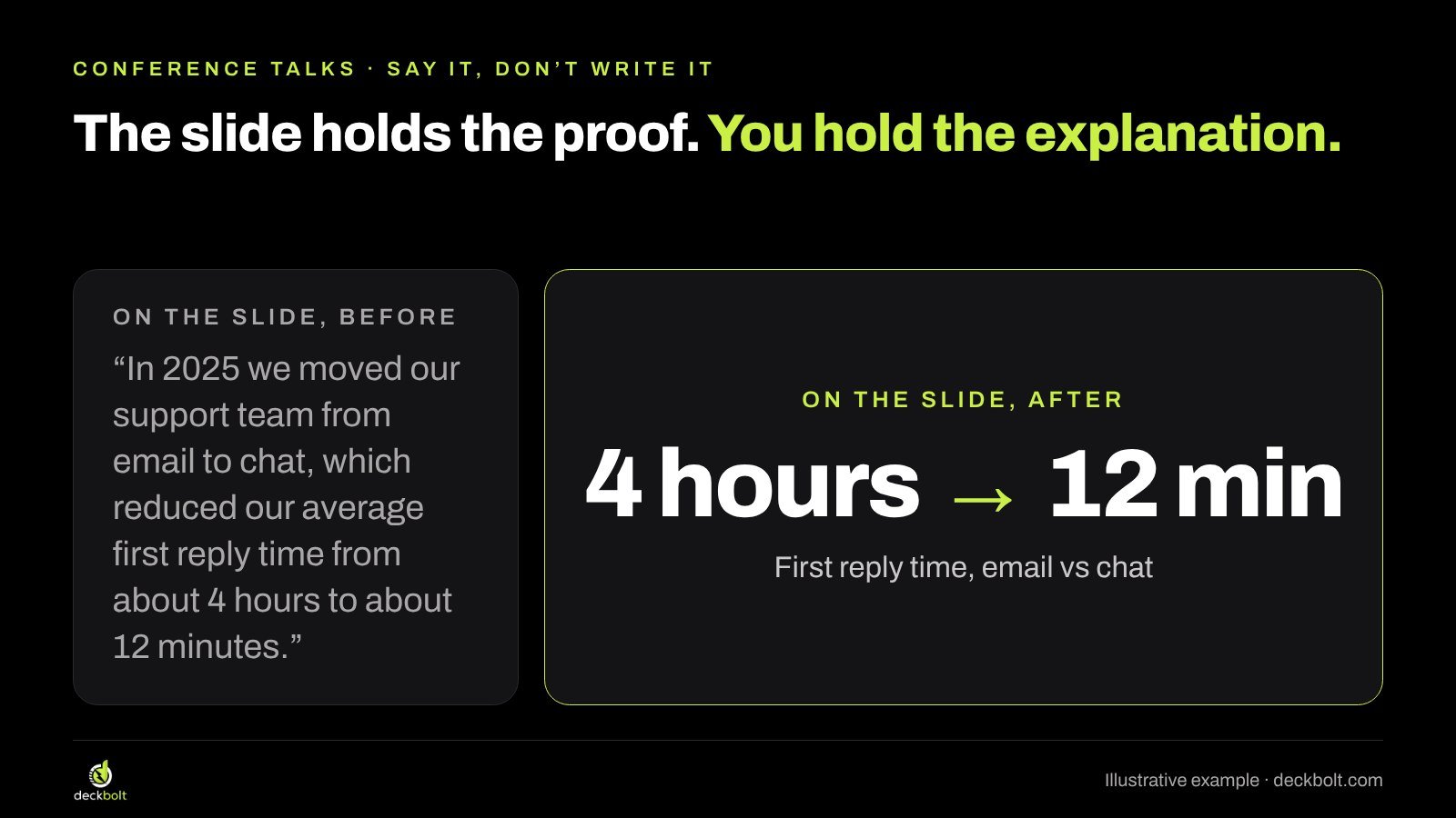
A simple rule removes most of the text from talk slides: if you are going to say it, it doesn’t need to be written on the slide as well. The slide holds the proof; you hold the explanation.
Compare two versions of the same slide. The first reads: “In 2025 we moved our support team from email to chat, which reduced our average first reply time from about 4 hours to about 12 minutes.” The second shows just “4 hours → 12 min”, with a small label underneath: “First reply time, email vs chat”. You say the sentence; the slide shows the number that makes it stick.
The sentences you remove don’t disappear. They move into your speaker notes, where they help you deliver the talk without putting a script on the screen. Our guide to slides with too much text goes deeper on cutting words without losing meaning.
Fix 5: Design for their screen, not yours
Your slides will be shown on equipment you have never seen. A short message to the organizers about a week before the event avoids most surprises. Ask about:
- Screen shape. Is it 16:9 or 4:3? Design in the right shape from the start; converting late often breaks layouts.
- Light or dark. Projectors in bright rooms wash out subtle colors. Strong contrast survives; pale gray text on white often doesn’t. If you can, test on a projector.
- Fonts. Will you use your own laptop or theirs? If theirs, use fonts that are installed everywhere, or bring a PDF.
- Video. Put video files inside the deck or in the same folder, and don’t rely on the venue Wi-Fi to stream them.
- Backup. Keep a PDF copy on a USB stick and in your email.
Dark or light backgrounds both work on stage; what matters is contrast. If you’re unsure which to choose, our article on dark vs light slides walks through the trade-offs.
Fix 6: End on the line they should remember
The last slide often stays on screen through the whole Q&A. “Thank you! Questions?” wastes that time. Instead, end with the one line you want people to remember and repeat, plus how to reach you.
For the support example, that might be: “Move support to chat. Reply in minutes, not hours.” Underneath, in smaller type, add your name, email and where to find the slides. While people ask questions, the main message stays in front of them.

A worked example, before and after
The example in this guide is illustrative: the company and numbers are made up to show the method.
Before. A 20-minute talk about moving customer support to chat, built as twelve slides. Most slides have a long title and four to six bullets. Charts show every support channel in a different color with a legend. The final slide says “Thank you! Questions?”.
After. The same talk, built as around thirty slides. Each slide carries one idea that matches one sentence of the script. The bullets have moved to the speaker notes. The key result appears as a big number, “4 hours → 12 min”, rather than a sentence. The channel chart is shown twice, first with email highlighted, then with chat highlighted. Every slide passes the back-row test. The talk ends on “Move support to chat. Reply in minutes, not hours.” with contact details underneath.
The speaker says roughly the same words in both versions. The difference is that the audience can follow along without reading.
Setting it up in PowerPoint and Google Slides
- Use Presenter View. In PowerPoint, go to Slide Show and tick Use Presenter View. In Google Slides, use the arrow next to Slideshow and choose Presenter view. Your notes stay on your screen; the audience sees only the slide.
- Set your text sizes in the master. In PowerPoint, use View → Slide Master; in Google Slides, use Slide → Edit theme. Set the title and body sizes once so every slide starts large enough.
- Check the slide size. In PowerPoint, Design → Slide Size; in Google Slides, File → Page setup. Match the venue’s screen shape.
- Export a PDF backup once the deck is final.
Checklist: five questions before you go on stage
- Does every slide pass the back-row test?
- Is there one idea per slide?
- Does each chart color only the line you will talk about?
- Did the sentences move into your speaker notes?
- Does the last slide show the one line to remember, with your contact details?
Also sending the deck afterwards? Send a version made for reading, not your stage slides. Our guide to presenting slides on a video call covers the online version of the same problem.
Need slides that work from the back row?
At DeckBolt we design keynote, conference and pitch slides in PowerPoint and Google Slides, with 475+ projects across 22 countries. If you have a talk coming up, send us your current deck and we’ll tell you what to change. Request a free deck review.
Need help with your next deck? See our presentation design services.