
You open a deck to make a few last edits and something feels off. Slide 4 reads comfortably. Slide 7 looks dense, almost cramped. You click into the text and the font is 13 pt, even though the template says 18 pt and you never changed it.
Nobody chose 13 pt. PowerPoint did, the moment the words stopped fitting in the box. The setting is called autofit, and in its most common form, “Shrink text on overflow”, it quietly makes your text smaller whenever there is too much of it. Google Slides has the same option.
Autofit is meant to be helpful, and for a quick draft it is. In a finished deck, it causes a problem that is easy to miss on any single slide and hard to miss when you flip through the whole thing: the body text jumps in size from slide to slide.
This guide explains what autofit does, why it matters for how your slides are read, how to find the text it has already shrunk, and how to turn it off at the source in PowerPoint and Google Slides. It ends with a short checklist.
Note: the slide examples and point sizes in this article are illustrative. Sizes assume a standard 16:9 PowerPoint slide (13.33 in wide).
What autofit actually does
Every text box and placeholder in PowerPoint and Google Slides has a setting for what happens when the text doesn’t fit. There are three options, and they behave very differently.
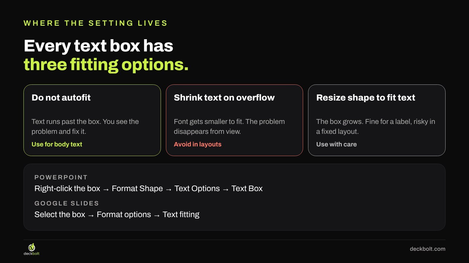
- Do not autofit. The text keeps its size and runs past the bottom of the box. It can look messy, but that is the point: you see the problem and fix it.
- Shrink text on overflow. The font size (and in PowerPoint, often the line spacing) is reduced until the text fits inside the box. The problem disappears from view.
- Resize shape to fit text. The box grows to hold the text. That is fine for a small label or a callout, but in a fixed layout a growing box can push into other content.
In PowerPoint you’ll find these under right-click on the box → Format Shape → Text Options → Text Box. In Google Slides, select the box and go to Format options → Text fitting.
Many templates have the shrink option switched on in their body placeholders, so it works without you noticing. You type a few more words than the layout was designed for, and the size steps down to make room.
Why shrinking text is a problem
A smaller font isn’t a fix. It’s a warning that the slide is trying to say too much, with the warning switched off. That has three costs.
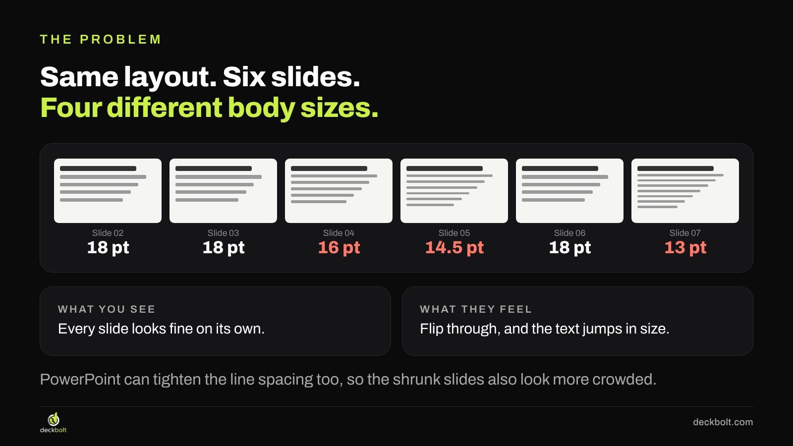
The deck stops looking consistent. Each slide looks fine on its own. But in our illustrative six-slide example, the same layout ended up with body text at 18, 18, 16, 14.5, 18 and 13 pt. When you or your audience flip through, the text visibly jumps in size and the shrunk slides look more crowded than their neighbours. People notice the inconsistency even if they can’t say what it is.
Hierarchy breaks. Good slides have a reading order: the title first, then the main point, then the details. Size is one of the main tools that creates that order. When body text shrinks to the size of captions and chart labels, everything looks equally (un)important, and nothing reads first.
Small text fails in the real world. 13 pt might be readable on your laptop. On a phone, on a projector at the back of a room, or in a small window on a video call, it can turn into a squint. Many decks get read on phones, so the smallest text on a slide matters.
Step 1: Find the text that has already been shrunk
Before you change any settings, find the slides where autofit has already done its work. There are two quick ways.
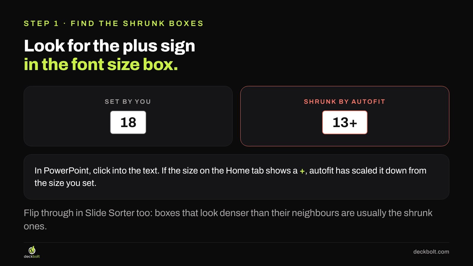
Look for the plus sign. In PowerPoint, click into a text box and look at the font size on the Home tab. If it shows a number with a plus sign, such as “13+”, the text has been scaled down by autofit from the size that was set.
Flip through in Slide Sorter. View → Slide Sorter (or the grid view in Google Slides) shows many slides at once. Boxes that look denser than the same box on neighbouring slides are usually the ones that have been shrunk. Make a note of them, because those are exactly the slides that have too much text.
Step 2: Turn autofit off at the source
You could fix each text box one by one, but in a 40-slide deck that is slow and easy to undo by accident later. It’s better to fix it where the slides come from.
In the slide master (PowerPoint). Go to View → Slide Master. Select the body placeholder on each layout, right-click → Format Shape → Text Options → Text Box, and choose “Do not Autofit”. New slides built on those layouts will keep their size. For slides that already exist, you may need to reset them (Home → Reset) or change the setting on their boxes directly.
For text you type (PowerPoint). Go to File → Options → Proofing → AutoCorrect Options → AutoFormat As You Type, and untick “AutoFit title text to placeholder” and “AutoFit body text to placeholder”. This stops PowerPoint from switching shrink on as you type.
In Google Slides. Select a text box and go to Format options → Text fitting → Do not autofit. To change it for a layout, open Slide → Edit theme, select the layout’s placeholder and set the same option there.
If you work from a company template, this is worth fixing once in the template itself. Everyone who uses it afterwards benefits. Our guide to building a master template your team will actually use covers the rest of that setup.
Step 3: When the text doesn’t fit, edit the text
Once autofit is off, some boxes will overflow. That’s the useful part: they are showing you the slides with too many words. Now fix the words, not the size.
In our illustrative example, a support update slide had this paragraph: “This quarter we rolled out the new help center, trained every agent on the updated refund process, and moved night shifts to cover the busiest hours. As a result, tickets now close in about a day instead of three, and customers rate support 4.6 out of 5.” That’s 47 words, and autofit had squeezed it to 13 pt.
The rewrite kept the result and dropped the warm-up: “Tickets close in 1 day, down from 3. Customers rate support 4.6 / 5.” That’s 14 words, and it sits comfortably at the template’s 18 pt.
Three ways to make room, in order:
- Cut the warm-up. Phrases like “This quarter we…”, “As you can see…” and “We are pleased to share…” rarely carry information.
- Move the how and why to the speaker notes. The slide shows the point. You say the explanation. If the deck will be sent ahead rather than presented, a short note line or an appendix slide can carry it.
- Split the slide. If a slide still has two points after cutting, it probably needs to be two slides. Slides are free; attention isn’t.
A helpful rule of thumb: decide a minimum size for body text in your deck (many designers use around 18 pt for a standard 16:9 PowerPoint slide) and treat anything that needs to go below it as a sign to edit.
Before and after
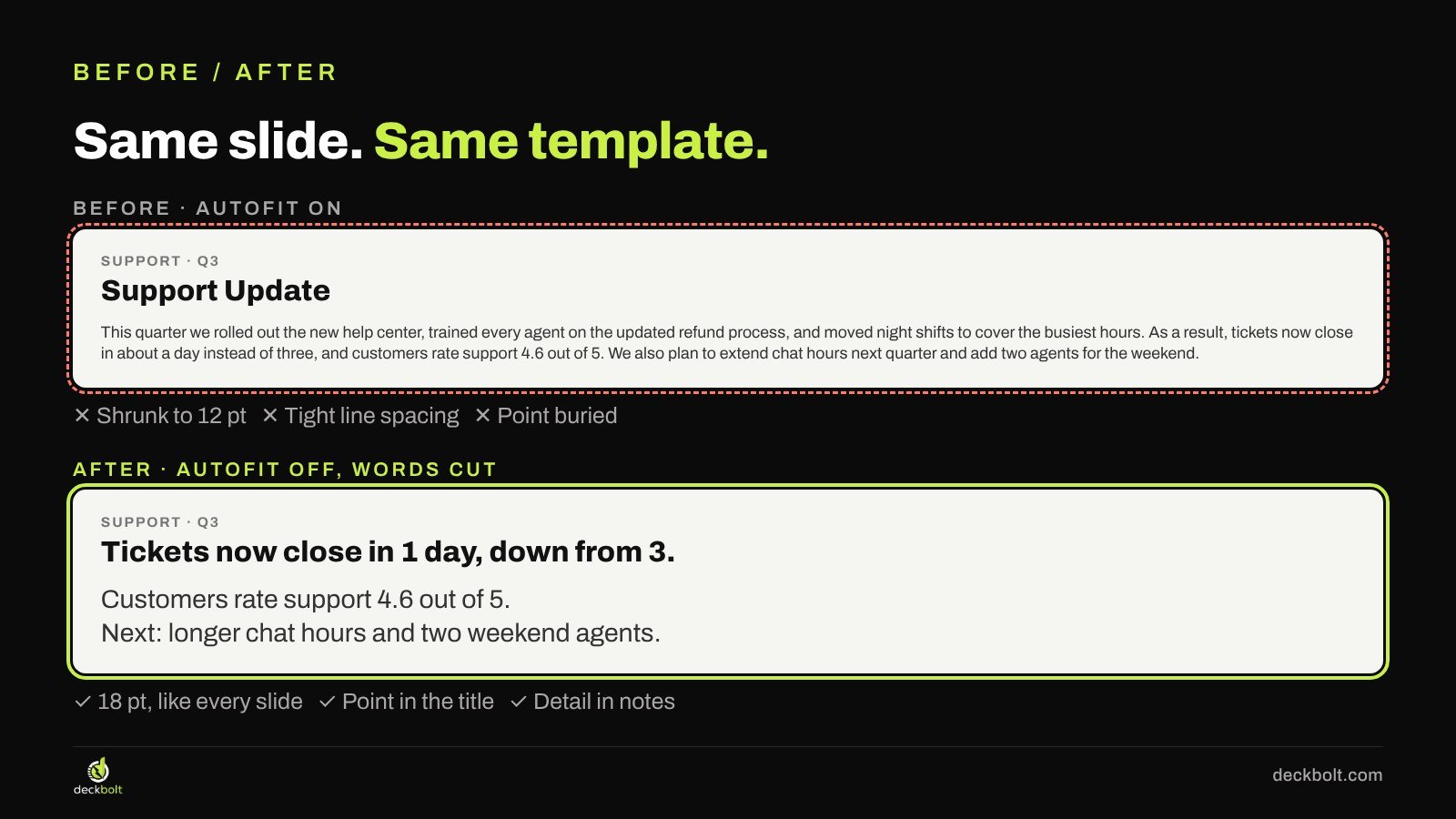
Before: a slide titled “Support Update” with a full paragraph that autofit had shrunk to 12 pt, with tightened line spacing. The actual news, faster ticket times and a strong rating, was buried in the middle of the paragraph.
After: autofit is off and the words are cut. The title carries the point (“Tickets now close in 1 day, down from 3.”), the body has two short lines at the template’s 18 pt, and the detail about how it happened is in the speaker notes. The slide is the same template and the same layout. It just reads first time.
When autofit is fine
Autofit isn’t always wrong. A few cases where it can help:
- Quick drafts. When you’re sketching structure and don’t care about polish yet.
- Small labels and callouts. “Resize shape to fit text” on a label lets the box hug its text, which is often what you want.
- Text that changes often. A live dashboard slide pulling in different names each week might need some flexibility, though fixing the box size and keeping labels short is usually better.
The trouble is only with “Shrink text on overflow” on body text in a finished deck, where it hides problems you would otherwise fix.
Common mistakes
- Fixing size by hand on each slide. Setting 18 pt manually on forty slides doesn’t stop the next edit from shrinking it again. Change the setting at the source.
- Making the box bigger instead. Stretching a text box over the margins or into the chart fixes the overflow but breaks the layout grid. Edit the text first.
- Shrinking the title too. Long titles can be shrunk as well. A title that needs three lines is usually a sentence that can be shortened.
- Forgetting converted decks. Moving a deck between PowerPoint and Google Slides can change font metrics, so text that fitted before may overflow after. Check sizes after any conversion.
A five-question checklist
- Is autofit set to “Do not autofit” in your layouts?
- Does any font size show a + sign?
- Is body text the same size on every slide?
- When a box overflows, did you cut words first?
- Is your smallest text still readable on a phone?
And a quick final test: click through the whole deck fast. If the body text jumps in size from slide to slide, autofit got there before you did. For related fixes, see why fewer type sizes make better slides, the flip test for consistent decks, how to make a deck readable on a phone and what to do when slides have too much text.
Want a deck that stays consistent?
DeckBolt designs pitch decks, templates and business presentations with type sizes that hold up on every slide, in PowerPoint and Google Slides. Send us your current deck and we’ll tell you which slides to fix first. Request a free deck review.