
A deck can look perfect in English and fall apart the moment it’s translated. Titles spill out of their boxes, labels wrap onto three lines, accented letters turn into empty squares, and a date that meant 3 April now reads as 4 March.
None of that is the translator’s fault. The words are usually fine. What breaks is the design, because it was built for one language and one way of reading.
This guide is for teams that present in more than one language: companies with clients across regions, founders pitching in several markets, and anyone who sends one deck to offices around the world. It covers why multilingual decks break, six fixes, how to set up the work in PowerPoint and Google Slides, and a short check for every language version.
Why translated decks break
Four things don’t travel with the words.
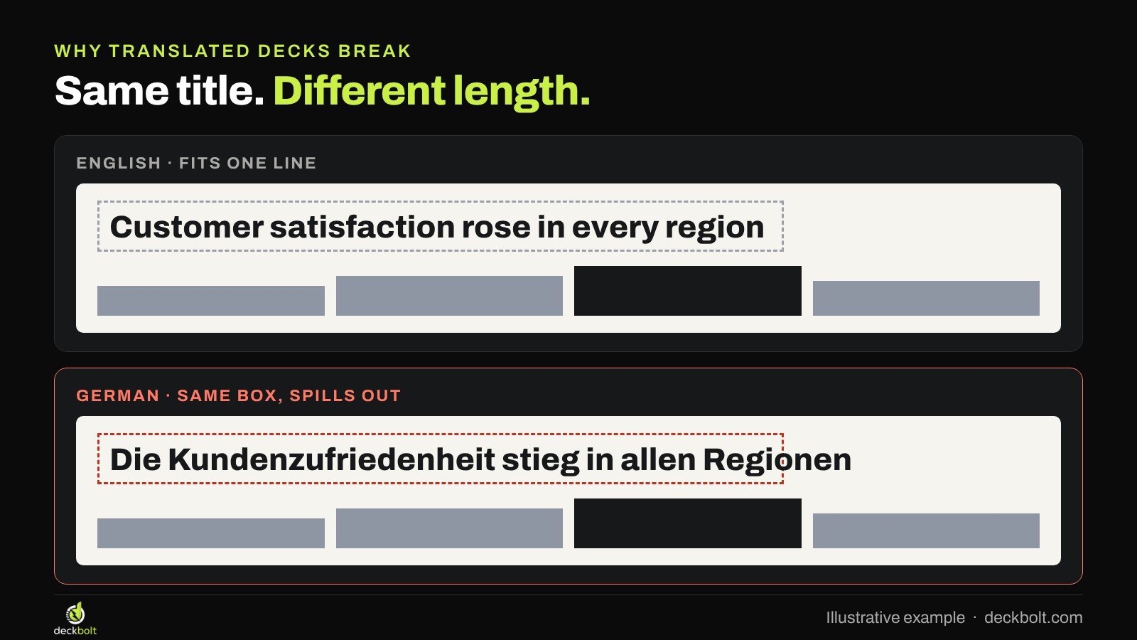
- Text length. The same sentence can run much longer in another language. German, French and Spanish often need more space than English.
- Letters. A font that looks great in English may not include the accents and characters another language needs.
- Numbers and dates. Decimal marks, thousands separators and date order all change between countries.
- Direction. Arabic, Hebrew and Urdu read from right to left, and the whole slide is read in that direction.
A translator handles the words. Someone still has to handle the slides. The fixes below make that job small instead of slide-by-slide surgery.
Fix 1: design for the longest language, not the first
The most common failure is a title box sized exactly to the English line. Translate it and the text spills over the chart below or shrinks until nobody can read it.
Build in room from the start. Give titles space for a second line. Avoid squeezing labels into narrow boxes or tight table columns. If you know which of your languages runs longest, lay out that version first and check the others against it.
Be careful with automatic text shrinking. It keeps the text inside the box, but it also means one slide’s title ends up smaller than the next one’s, which breaks the type system you designed. A deck that uses a few fixed type sizes is easier to keep consistent across languages.
Fix 2: keep text out of images
Text that is part of a picture can’t be translated. Someone has to redraw the image for every language, and in practice that often means the image stays in English while everything around it changes.
Build diagrams, charts, process steps and labels as live elements on the slide: shapes, text boxes and native charts. Then the translator edits them like any other text. The same applies to screenshots of tables and to infographics exported from another tool. If it carries words, it should be editable.
Fix 3: pick fonts that cover every language you need
Brand fonts are often chosen by looking at English text. Then the Polish, Turkish or Vietnamese version arrives and some letters show as empty boxes, or the app quietly swaps in a different font for the missing characters.
Before you settle on a typeface, paste a real sentence in each of your languages into it and look closely at the accents. If you need scripts beyond Latin, such as Arabic, Greek or Cyrillic, check those too. Some brands use one font family for Latin languages and a matching family for other scripts. Set this in the theme, so the right font applies everywhere.
Fix 4: write numbers and dates the way the reader reads them
Numbers look universal, but they aren’t. The same amount is written differently depending on where the reader is:

- United States: 1,250.50
- Germany: 1.250,50
- France: 1 250,50
Dates are worse, because they can be misread without anyone noticing. “03/04/2026” is 3 April to some readers and 4 March to others. Spelling out the month, as in “3 Apr 2026”, is clear almost everywhere.
Currency placement changes too, as do units and the way large numbers are abbreviated. Agree with your translators on one format per language, write it down, and apply it to charts and tables as well as body text. Chart labels are easy to miss because they often come from a spreadsheet.
Fix 5: mirror the layout for right-to-left languages
In Arabic, Hebrew and Urdu, the eye starts on the right. A slide that reads well left to right can feel backwards when only the text direction changes.
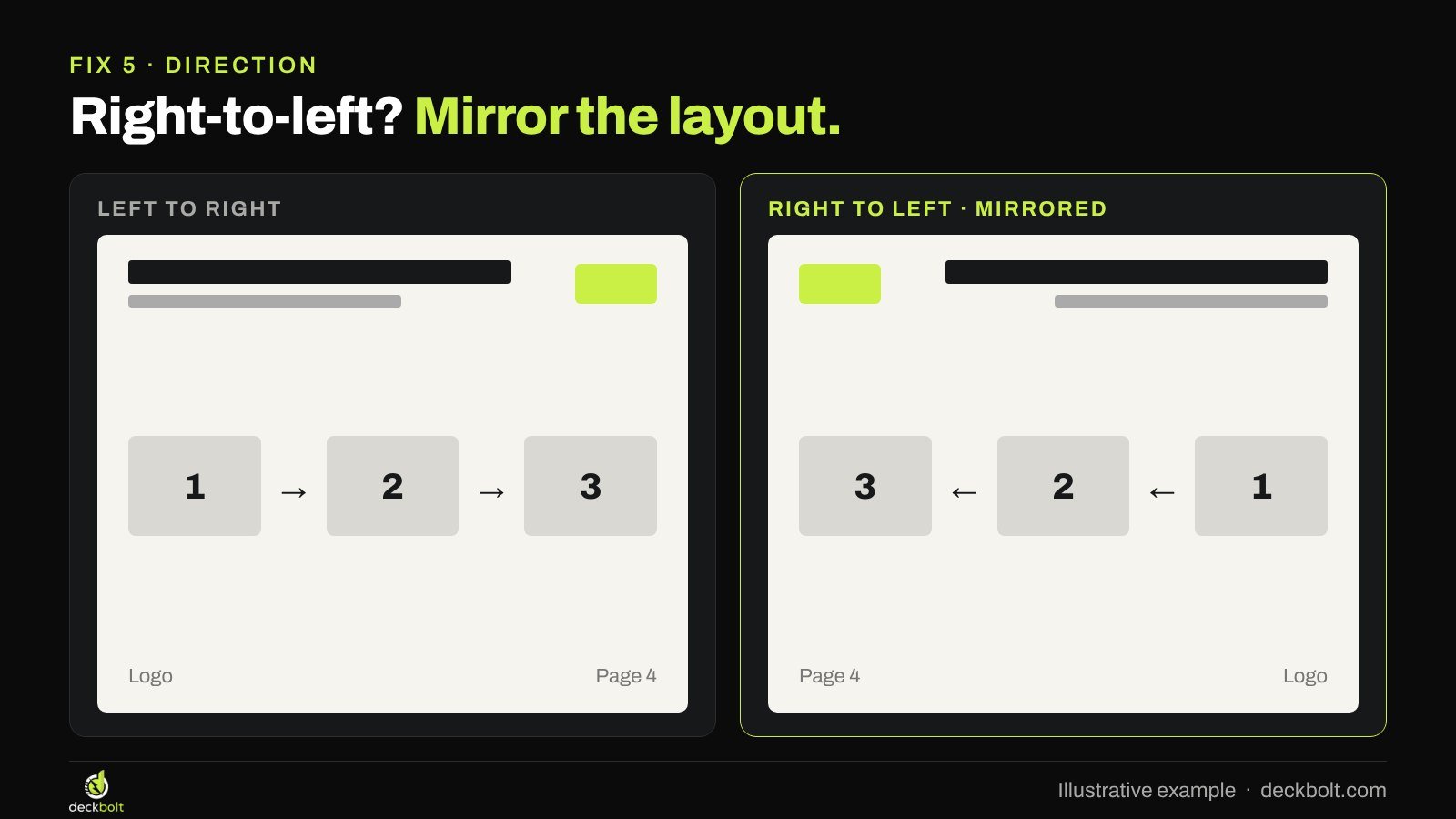
For these languages, mirror the layout: align titles and text to the right, move the logo and page number to the opposite side, and flip arrows that show sequence. Timelines and charts need a decision: agree with your translator or local team which way they should run, so every slide follows the same rule.
PowerPoint and Google Slides both support right-to-left text, but how you switch it on depends on your language settings. Test it on one slide before you start, and keep a separate right-to-left master if you present in these languages often.
Fix 6: one master deck, translate the words, not the layout
The cleanest way to run multilingual decks is to separate the design from the words.

- One source deck. Every layout lives in the slide master, built with room to spare. Translators never move boxes.
- Translate in the file. Copying text into a spreadsheet and pasting it back by hand is where mistakes creep in.
- Set the language. In PowerPoint, Review → Language → Set Proofing Language makes spell check work for the translated text.
- Check every slide. Flip through each version looking for spills, awkward wraps and single words left alone on a line.
A master template your team will actually use makes this far easier, because every title, label and chart already sits in a layout that leaves room.
Setting it up in PowerPoint and Google Slides
A few settings save hours later.
- Put every text style in the master. Title, body and label sizes set in the slide master carry into every language version. Local edits on single slides are what make versions drift apart.
- Use placeholders, not loose text boxes. Text in placeholders follows the layout. Loose boxes stay where they were drawn, whatever the language.
- Turn off autofit in the master. Decide the sizes yourself, then check every language against them, rather than letting each slide shrink on its own.
- Embed or share fonts. In PowerPoint for Windows, File → Options → Save has an option to embed fonts in the file. Otherwise, make sure every office that edits the deck has the font installed.
- Build charts from data in the file. Then the translator can change axis labels and legends, and the number format follows the data.
Working with translators
Translators do their best work when they know where the words will sit. Send them the deck itself, not just a list of sentences, so they can see that a title has room for two lines and a chart label has room for one word.
Tell them the limits up front. If a label can’t be longer than about 20 characters, say so. A good translator can often find a shorter phrase that means the same thing, but only if they know the space is tight. Ask them to flag any line they had to shorten, so someone can check it still says what you meant.
Last, agree who checks the finished slides. The translator knows the language; the designer knows the layout. The best check is someone who reads the language looking at the final design, not the text in a spreadsheet.
A worked example
Take an illustrative quarterly results deck that goes to offices in the United States, Germany and the Gulf. The English version has a title on every slide sized to one line, a process diagram exported as a picture, numbers written as 1,250.50 and dates like 03/04/2026.
Here’s how the fixes play out. The title boxes get room for two lines, set in the master. The process diagram is rebuilt from shapes and text boxes. A short style sheet records the number and date format for each language. The theme font is checked against German umlauts and the ß. For the Arabic version, a mirrored master aligns everything to the right and the team agrees which way the timeline runs. Finally, someone who reads each language flips through the finished file.
None of this is extra design work after the first round. It’s set up once, and every future version of the deck benefits.
Common mistakes
- Shrinking text to fit. It solves one slide and breaks the type system.
- Leaving English inside images. Readers notice immediately.
- Trusting a font without testing it. Missing letters often show up only in the final version.
- Mixed number formats. A chart from the spreadsheet in one format next to text in another looks careless.
- Mirroring text but not layout. Right-aligned text with the logo, arrows and timeline still left to right reads oddly.
A five-question check for every language version
- Do titles have room for a longer language?
- Is every label live text, not part of an image?
- Does the font cover every language?
- Are numbers and dates written for this reader?
- Has someone checked every slide in every language?
It also helps to run a quick flip test on each version: click through fast and watch for anything that jumps.
The examples in this article are illustrative. Menu names and language options can vary between versions of PowerPoint and Google Slides.
Presenting to clients or teams in more than one language? DeckBolt designs master templates and decks in native PowerPoint and Google Slides for clients across 22 countries. Request a free deck review.