
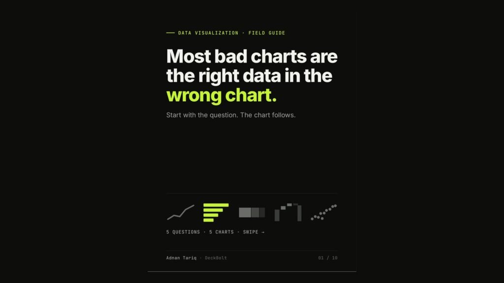
When a chart does not land, the data is rarely the problem. Most bad charts are the right data in the wrong chart. The fix is to start with the question the slide is answering. The chart follows.
Before anything else: write the question
One slide, one question. Write it as a single sentence, for example “Which region grew fastest this year?” If you cannot write it as a sentence, the chart is not ready yet.
Once you have the question, there are five common ones, and each has a chart that answers it best.
1. “How has it changed over time?” Use a line chart
Time runs left to right. Make the line that matters bold and in your accent colour, and grey out everything else so it stays as context rather than competition.
2. “Which one is bigger?” Use a sorted bar chart
Sort largest to smallest so the ranking reads instantly. Horizontal bars leave room for long labels, such as region or product names. Highlight the bar that answers the question.
3. “What is it made of?” Use a 100% stacked bar
A 100% stacked bar shows composition and makes it easy to compare two periods side by side, for example channel mix in 2025 against 2026. A pie works for two or three parts. Beyond that, angles get hard to compare.
4. “How did we get from A to B?” Use a waterfall chart
Show each step that added or took away: a starting value, new business, upsell, churn, and the end value. Waterfalls are made for revenue bridges, budgets and forecasts.
5. “Are two things related?” Use a scatter plot
Each dot is one item. The pattern is the message, so add a trend line and name the outlier. For example, marketing spend against sign-ups, with the one point that breaks the trend labelled.
Then make the chart say the answer
Choosing the right chart type is half the job. The other half is putting the takeaway in the title and highlighting the one element that proves it.
- Before: “Revenue by quarter”, four coloured bars and a legend to decode.
- After: “Q4 was our strongest quarter, up 46% on Q3”, three grey bars, one dark bar for Q4 with its value labelled. Nothing to decode.
Save this: question → chart
| If the slide asks | Use |
|---|---|
| How has it changed over time? | Line |
| Which one is bigger? | Sorted bar |
| What is it made of? | 100% stacked bar |
| How did we get from A to B? | Waterfall |
| Are two things related? | Scatter plot |
Examples use illustrative data. For a broader look at data visualisation, see Choosing the Right Chart.
Charts in your deck not landing? Send it over for a free deck review and we will show you which charts to change first.