
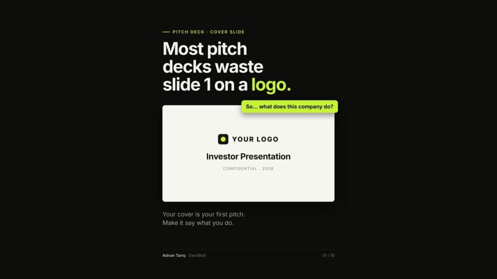
Most pitch deck covers look the same: a logo, the words “Investor Presentation” and “Confidential · 2026”. The reader’s first thought is: so what does this company do?
Your cover is your first pitch. Make it say what you do.
Why it matters: the cover is the one slide everyone sees
- It is on screen while people join the call, before you have said a word.
- It is the first page when your PDF is opened, and often the preview image too.
- It is the only slide every reader sees, including the ones who stop at page 3.
A logo cannot do that job. A sentence can.
The fix: one line that answers three questions
Swap the tagline for one line that answers: who is it for, what does it do, and what changes for them?
Formula: [Company] helps [who] [do what], [with what result].
Illustrative example: “We help small construction crews file daily site reports from a phone, in five minutes.”
Step 1: Plain words. Say what it does, not what it is revolutionising
Words like “revolutionising”, “AI-powered platform”, “next-generation”, “seamless” and “end-to-end” could describe a thousand other startups, so they tell nobody about yours.
- Before: Revolutionising construction with an AI-powered platform.
- After: Daily site reports for construction crews.
Tip: use the verb your customer would use.
Step 2: Name a customer you could actually call
Narrow it down step by step: businesses → construction companies → small construction crews → contractors with crews of 5–20. Specific sounds smaller. It also sounds like you have met your customer.
Step 3: End on what changes for them, not on a feature
| Feature | Result |
|---|---|
| Mobile reporting app | Reports filed from the site, not the office |
| Automated report builder | Five minutes instead of an evening of paperwork |
| Photo uploads | Proof of the work, with a date on it |
A result has a before and an after. A feature only has a name.
Step 4: Design it. Make the line the biggest thing on the slide
- The one-liner: the largest text on the slide.
- The logo: small and top-left. A signature, not the headline.
- Contact, round and date: small, at the bottom, so people can reply.
The rebuilt cover reads: “Daily site reports for small construction crews. Done from a phone in five minutes.” with the founder’s name and email at the bottom left and “Seed round · 2026” at the bottom right. Same slide, but now it pitches.
Test your one-liner before you design it
- Could a stranger repeat it after one read?
- Would it stop being true with a competitor’s logo on it?
- Would your customer use these words?
- Can you say it out loud in one breath?
- Does it match the first line of your intro email?
Five yeses, and your cover starts pitching on slide 1.
Examples are illustrative. For what comes after the cover, see Pitch Deck Structure.
Want a second pair of eyes on your pitch deck? Send it over for a free deck review. We will review it from the cover to the closing slide and tell you what we would fix first.