
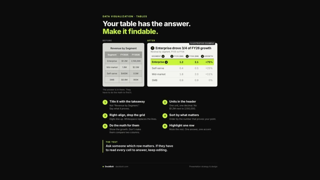
Tables are where good data goes to hide. The answer is in there, but the reader has to do the maths to find it, and most will not.
Before: the answer is in there somewhere
The illustrative “Revenue by Segment” table has four rows and two years of figures. The units are mixed: $1.2M sits next to 2,100,000, and $400K next to 0.5M. There are heavy gridlines, centred numbers and no growth column. To find which segment drove growth, the reader has to compare every pair of cells.
After: one answer, one accent
The rebuilt table is titled “Enterprise drove 3/4 of FY26 growth”. It shows revenue by segment for FY25 and FY26 in one unit, adds a growth column, sorts the rows by what matters, and highlights a single row: Enterprise, up 75%.
The six fixes
1. Title it with the takeaway
Not “Revenue by Segment”. Say what the table proves.
2. Put units in the header
One unit, one decimal. No $1.2M next to 2,100,000. Write “FY25 ($M)” once in the header and keep the cells clean.
3. Right-align and drop the grid
Right-aligned digits line up, so magnitudes are easy to compare. Whitespace replaces the lines.
4. Sort by what matters
Order the rows by the number that proves your point, not alphabetically or in the order the data came out.
5. Do the maths for them
Show the growth. Do not make the reader compare two columns in their head.
6. Highlight one row
Mute the rest. One answer, one accent colour.
The test
Ask someone which row matters. If they have to read every cell to answer, keep editing.
The figures above are an illustrative example. For more on presenting data, see Choosing the Right Chart.
Got a data-heavy deck? Send it for a free deck review.