
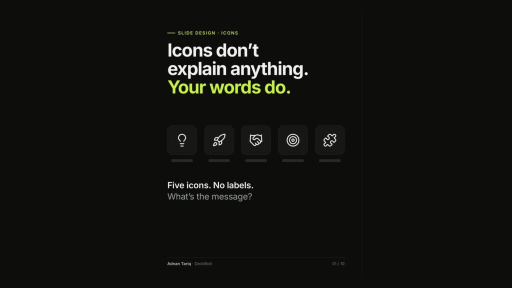
Here is a quick test. Five icons, no labels: a lightbulb, a rocket, a handshake, a target and a jigsaw piece. What is the message? There is not one. Icons do not explain anything. Your words do.
The usual slide: icon soup
A typical “Why choose us” slide gives every bullet a picture: innovation, growth, partnership, focus, security and efficiency. The icons come in mixed styles, six sizes, six colours and three alignments, and they add zero new information. Each icon was picked on its own. Together, they are noise.
The rule: every icon needs a job
- Job 1, help people scan: mark repeated sections so the eye finds them fast.
- Job 2, show a familiar thing: email, phone, location or calendar, read at a glance.
- Job 3, tag a category: the same icon, with the same meaning, on every slide.
If an icon does none of these, cut it. The slide gets calmer, and nothing is lost.
Test 1: Cover the label. Does the icon still say it?
Cover the label on a rocket icon and readers guess growth, launch, speed or startup: it needs the label. Cover the label on a calendar and readers say “a date, a schedule”: it is clear on its own.
Most icons need their label, so the label is doing the work. Keep a label on every icon.
Test 2: One family. Never mix styles
Thin, thick, filled and outline icons in one row look accidental. Use one icon set with the same stroke weight, the same corners and the same level of detail: outline or filled, not both, and one set per deck.
Test 3: Same size, same colour, same spot
- One size per level of the slide.
- One colour, usually your text colour. Save the accent.
- One position: the same spot in every card, aligned with the text.
Test 4: Literal beats cliché. Skip the lightbulb
| Cliché | Literal |
|---|---|
| Smart features (lightbulb) | Photo site reports (camera) |
| Fast (rocket) | Live in one day (clock) |
| Great support (handshake) | Live chat, 7 days a week (headset) |
| Focused on you (target) | Built for teams of 5–20 (people) |
A cliché says you have a feature. A literal icon and label say which one.
Six vague icons, three clear reasons
The illustrative “Why choose us” slide with six buzzword icons becomes “Why teams switch to us”: three cards in one icon set and one size, each with a label that says something. “Live in one day: import your team and start the same day.” “Reports build themselves: updates from the field land in one report.” “Live chat, 7 days a week: a real person answers, weekends too.”
Run this icon check before you send
- Every icon has a job: scan, recognise or tag.
- Every icon has a label.
- One set, one style, one stroke weight.
- One size and one colour per level.
- Same icon, same meaning, on every slide.
- Nobody would miss it? Cut it.
Fewer icons, used the same way every time, read as a system, not as decoration. For more on keeping a deck consistent, see The Flip Test.
Want a second pair of eyes on your deck? Send it over for a free deck review. We will show you what is adding noise, what is missing, and what we would fix first.