
The brief
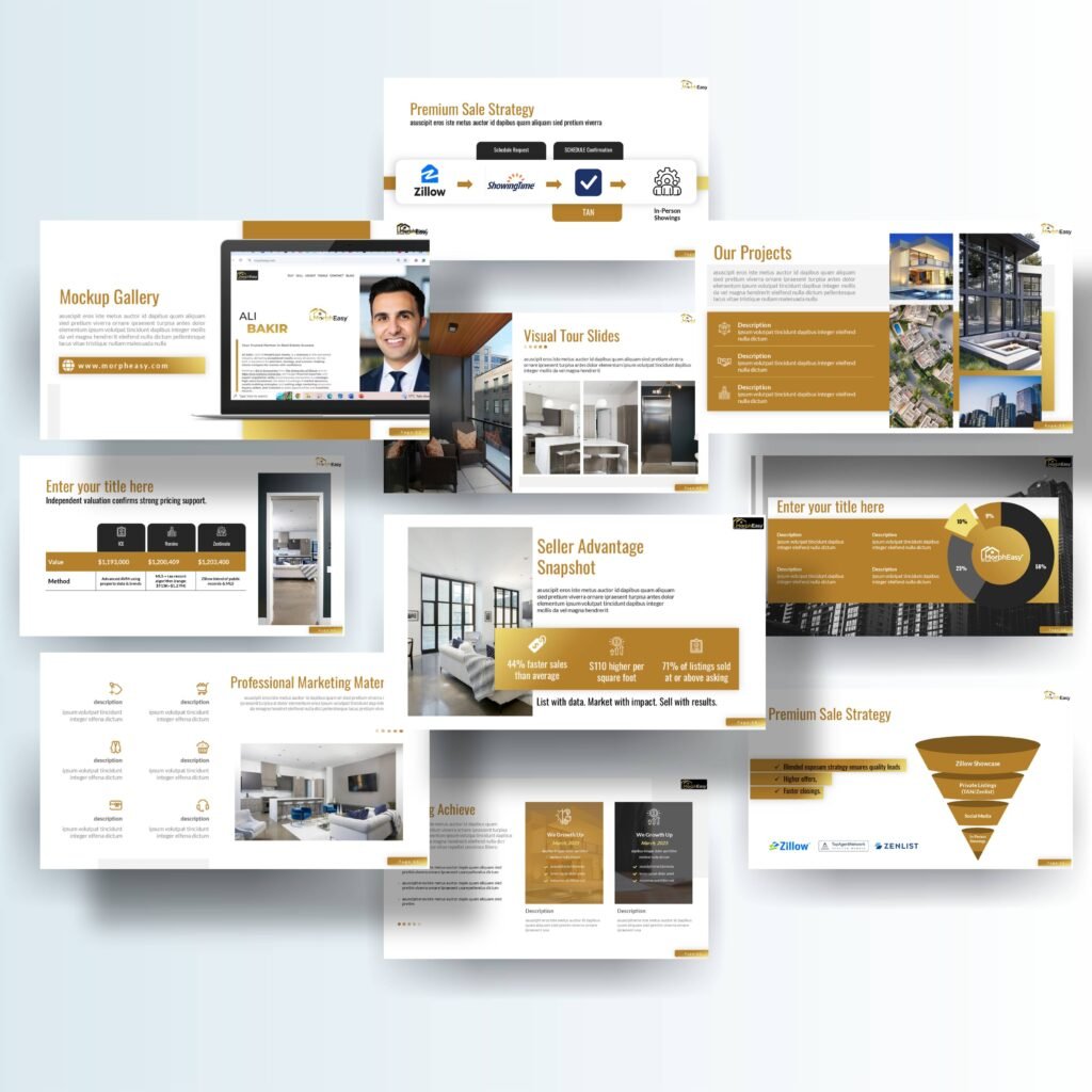
Morph Easy (morpheasy.com) is a real estate platform, and this investor deck was built around the two things property investors actually interrogate: yield models and development timelines. Alongside the investment story, the deck carries the platform’s seller-facing method — a premium sale strategy, visual tour slides, a project gallery, and the marketing funnel that moves a listing from exposure to showing.
Real estate decks live or die on the balance between imagery and evidence. Property sells visually, but investment decisions are made on numbers — valuations, methods, timelines — and the deck had to hold both without either one swamping the other.
The challenge
The default failure of a real estate deck is adjective inflation: beautiful photography, superlative language, and numbers scattered wherever they fit. Sophisticated readers discount it instantly. The moment a valuation appears without a method behind it, or a return figure appears without the timeline that produces it, the deck stops being an investment document and becomes a brochure.
Morph Easy’s material had the substance to avoid that trap — an independent valuation process with compared methods, a structured sale strategy with defined stages, a seller-advantage snapshot — but substance only counts if the design separates it cleanly. A reader has to be able to tell, on every slide, whether they are looking at the dream or the evidence for it.
What we did
We built the deck on a premium gold-and-white system and gave each type of content its own layout discipline. Projects get photo-led showcases: large imagery, structured descriptions, the property allowed to sell itself. The investment mechanics get the opposite treatment — quiet, tabular, precise. The valuation section presents the independent valuation approach with a method-comparison layout, so the investor can see how a price was arrived at rather than being asked to trust it. Development timelines are set out as timelines — sequence visible at a glance — rather than described in paragraphs.
The sale strategy is presented as what it is: a funnel. Showcase exposure on platforms such as Zillow Showcase, private listings, social media promotion, and in-person showings form defined stages, each with its role, so the seller story reads as a system rather than a hope. A seller-advantage snapshot layout gathers the client’s headline figures into a single frame, where they can be absorbed in one look — and where, importantly, they read as the client’s own published numbers, clearly framed.
The deck
The visual tour slides deserve a note of their own. In a platform business, the tour is where a listing becomes a viewing, and the deck treats those pages to the same production standard as the cover — full-frame imagery, minimal text, nothing standing between the reader and the property.
The result is a deck that can open a meeting with beauty and survive the questions afterwards: imagery and yield in separate registers, every claim given an address. Because the layouts are a system, new projects and updated figures drop in without breaking the deck’s composure — essential for a platform whose inventory changes constantly.
If your investment deck has to be beautiful and believed, those are design decisions, not luck. See how our pitch deck design services handle investor materials, and check presentation design pricing for the fixed-scope packages.