
The brief
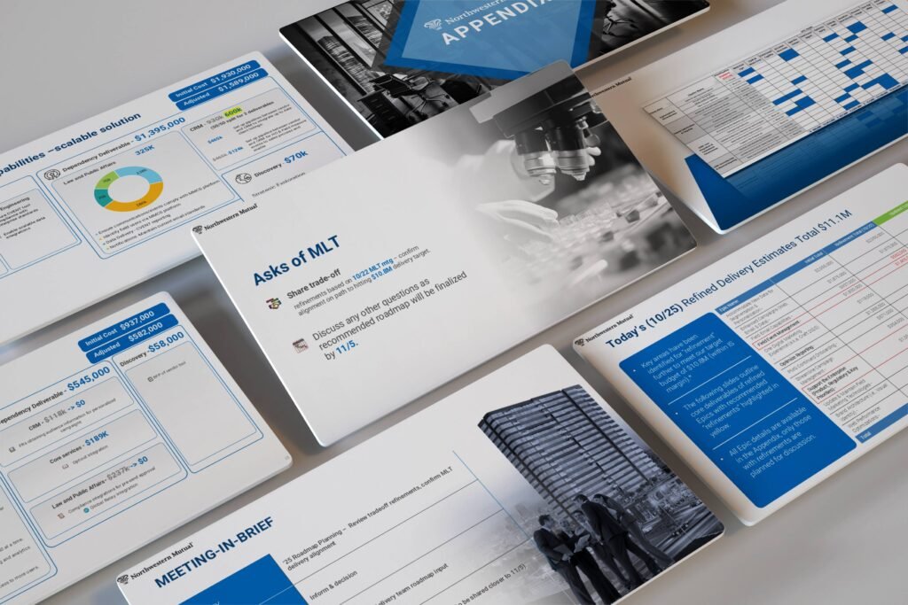
This project was a roadmap and budget planning deck for enterprise stakeholders — the working document for a planning cycle at a large financial-services organisation (the deck carries Northwestern Mutual’s branding), covering a meeting-in-brief, the decisions being asked of leadership, refined delivery estimates, dependency deliverables and a roadmap timeline.
Unlike a pitch, this deck was never going to be “presented” in the theatrical sense. It was going to be worked through, line by line, by senior stakeholders comparing numbers across pages and landing on decisions. And because planning cycles repeat, the deck was built as a reusable system rather than a one-off: layouts the team can carry into the next cycle instead of starting from a blank file.
The challenge
Planning material is spreadsheet material. Delivery estimates run to line items across initiatives; dependencies connect deliverables across teams; costs arrive in two versions — the initial estimate and the adjusted figure after review — and a stakeholder’s whole job in the meeting is to see what changed, what it depends on, and what they’re being asked to approve.
Presented badly, that material becomes a wall of tables: inconsistent columns, totals in different places on every page, changes invisible unless someone already knows where to look. In a room full of executives, that doesn’t just look untidy — it slows decisions down and quietly erodes trust in the numbers themselves. The design problem was to make a very dense document feel calm, comparable and decidable.
What we did
The deck opens with a meeting-in-brief: the purpose, the framing and the asks of leadership stated up front, so stakeholders know what decisions the rest of the document is building toward before they meet a single number.
The core of the design is a strict table system. Estimates and dependency deliverables use the same column structure on every page — initiative, deliverable, initial cost, adjusted cost — so a figure in one table can be compared with a figure three pages later without re-learning the layout. Change is given a consistent visual treatment: where an adjusted figure replaces an initial one, that relationship is obvious at a glance rather than buried in a footnote. Highlight colour is rationed, reserved for totals and for the items that need a decision, so emphasis still means something by page twenty.
The roadmap itself is set as a timeline grid — deliverables against time — that stakeholders can read horizontally for sequence and vertically for load. Supporting detail sits in a structured appendix, close enough to check, far enough not to interrupt the decision flow.
The deck
The result is a planning deck that behaves like the organisation it serves: ordered, consistent, and built to be reused. The same masters, table styles and callout treatments carry into the next planning cycle — which is the real value of treating a deck like this as a template system rather than a document.
If your internal decks are where decisions go to slow down, a system fixes that. Our pitch deck design services include template and design-system builds, and presentation design pricing covers the Brand Template System package in detail.