
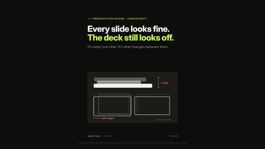
You have checked every slide and each one looks fine. Yet the deck as a whole still feels slightly off. The reason is rarely one slide. It is what changes between them: a title that drifts by a few pixels, three different left edges, a colour that means something different halfway through.
The flip test
Click through your deck fast and watch what jumps. Your audience never sees one slide on its own. They see a sequence, like a flip book.
- Should stay put: title position, margins, logo and page number, and what each colour means.
- Should change: the message, the content, and the one thing you highlight.
Here are the six jumps we see most often, and how to fix each.
1. Title position
Titles that move make the whole deck feel unstable. Overlay three slides and the title lands in three different places.
Fix: one title placeholder, in the same spot, on every slide.
2. Margins
When content boxes start and stop in a different place on every slide, each slide breathes a little differently.
Fix: pick one margin, set it with guides, and let nothing cross it.
3. Colour meaning
Green means “us” on slide 3 and “rival” on slide 7. The highlight switches sides, and viewers have to relearn it.
Fix: give each colour one job and keep it for the whole deck. Green always means us; grey is everyone else.
4. Chart styles
Three charts with three completely different styles: new colours, gridlines and markers every time, so nothing connects.
Fix: one chart style, with the same fonts, gridlines, labels and highlight colour. Same grey, one highlight, no clutter, and every chart looks related.
5. Icons
Outline, filled and coloured icons all in one deck, with four styles and four stroke weights. It reads as clip art.
Fix: one icon family, one stroke weight, one accent colour. It reads as designed.
6. Formats
$1.2M on one slide, $1,200,000 on the next and “1.2 million” after that. Q3 2026, 3Q26 and Jul–Sep ’26. Title Case, Sentence case and ALL CAPS. Readers stop to decode.
Fix: choose one format for money, dates and capitalisation, and write it down.
The fix is upstream: build the system once
Do not fix these slide by slide. Build them into the template so they cannot drift: a title placeholder in the same spot with the same style, a content area inside the margins, defined colour roles (us, others, neutral), and a footer with the page number and logo.
- PowerPoint: View → Slide Master, plus guides.
- Google Slides: Slide → Edit theme, plus guides.
Lock down titles, margins, colours, charts, icons and formats. Then flip-test again. For a deeper look at template systems, see How to Build a Master Template Your Team Will Actually Use.
Not sure what is jumping in your deck? Send it for a free deck review. We will flag what breaks the flow and how to lock it down.