
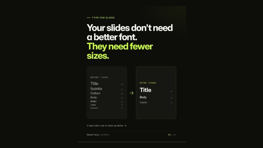
When a slide feels busy, the instinct is to change the font. Usually the font is fine. The problem is how many sizes are on the slide.
The problem: clutter often starts with type
A typical “Q3 Performance Overview” slide might use seven sizes: a 28pt title, a 24pt subtitle, bullets at 18, 16, 20 and 14pt, a 24pt callout box and an 11pt footnote. Seven sizes means seven levels of importance. The reader cannot rank them, so everything reads as “busy”.
Here are the six rules we use to clean up decks.
Rule 1: Pick three sizes. Four if you have a hero number
- Title: 40pt
- Body: 20pt
- Caption: 14pt
- Hero number (optional): 96pt
Every extra size asks the eye a question: is this more important?
Rule 2: Jump big, or do not jump
A 20pt heading over 18pt body text looks like a mistake. A 40pt heading over 20pt body text looks like a clear hierarchy. A good rule of thumb is a step of 1.5 to 2 times between one level and the next.
Small differences do not read as hierarchy. They read as inconsistency.
Rule 3: Use weight and colour before size
Bold, regular and grey give you three clear levels at a single size. “Pricing” in bold, “Three plans, billed yearly” in regular and “Cancel anytime” in grey reads more clearly than the same three lines in three different sizes. Fewer sizes, same hierarchy.
Rule 4: Keep lines short
Full-width text boxes make the eye lose its place. A narrower column of roughly 8 to 12 words per line reads faster and leaves room for a visual alongside it.
Rule 5: Hold one left edge
Centred body text gives the eye a new starting point on every line. Left-aligned text gives it one anchor. Save centring for one short line, such as a section title.
Rule 6: Lock it into the master
Set the styles once, where they cannot drift:
| Style | Size | Weight | Colour |
|---|---|---|---|
| Title | 40 | Bold | Ink |
| Body | 20 | Regular | Grey 80 |
| Caption | 14 | Regular | Grey 50 |
| Hero | 96 | Bold | Accent |
In PowerPoint, use the Slide Master. In Google Slides, use Edit theme. Styles set in the master survive slide 40, a second editor and a last-minute rewrite.
The result
The same Q3 slide, rebuilt with three sizes and one hero number, leads with a headline (“Our best quarter so far, with growth in every region”), three short supporting lines and a single large “2” for new enterprise accounts. Nothing important was cut. The text just stopped competing with itself.
Is your type fighting your message? Send us your deck for a free deck review. We will mark where the hierarchy breaks down and what to fix first. No cost, no obligation.