
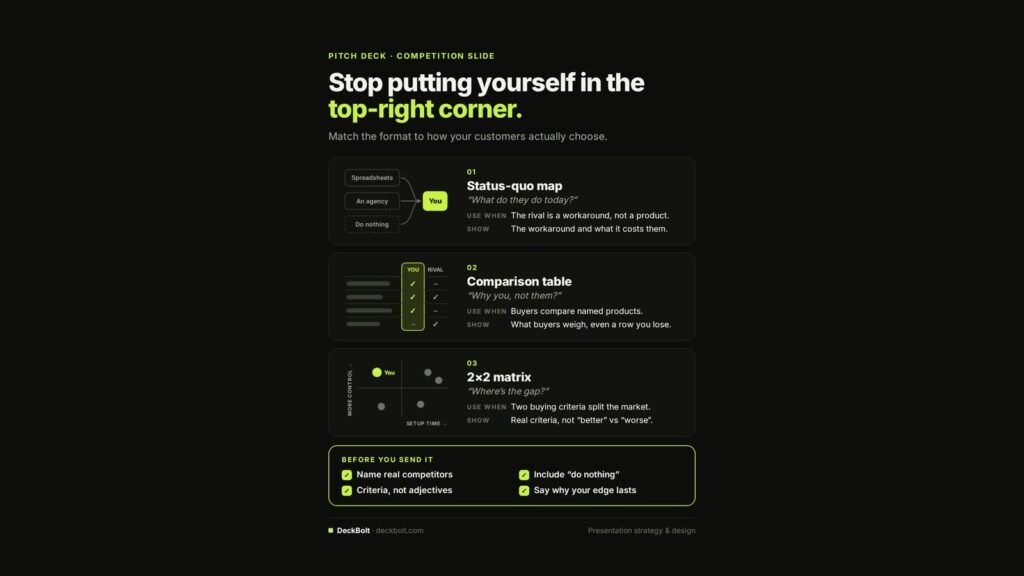
The classic competition slide is a 2×2 grid with your logo alone in the top-right corner. Investors have seen it so often that it signals the opposite of what you intend. The better approach is to match the format to how your customers actually choose.
Here are three formats, and when each one fits. (For more on the thinking behind this slide, see How to Design a Competition Slide That Doesn’t Make You Look Naive.)
1. The status-quo map: “What do they do today?”
Use when: the rival is a workaround, not a product.
Show: the workaround and what it costs them.
For many early-stage companies, the real competition is spreadsheets, an agency, or doing nothing at all. Map those options and show what each one costs the customer in time, money or risk.
2. The comparison table: “Why you, not them?”
Use when: buyers compare named products.
Show: what buyers weigh, even a row you lose.
Rows should be the criteria buyers genuinely use. Including a row where a rival beats you makes the rest of the table more credible, not less.
3. The 2×2 matrix: “Where is the gap?”
Use when: two buying criteria split the market.
Show: real criteria, not “better” versus “worse”.
A 2×2 only works if both axes are things customers actually trade off, such as setup time against level of control. If your axes are “good” and “innovative”, the chart is decoration.
Before you send it
- Name real competitors. Vague categories look like avoidance.
- Include “do nothing”. It is often the option you are really up against.
- Use criteria, not adjectives. “Setup in one day” beats “easy to use”.
- Say why your edge lasts. An advantage a rival can copy next quarter is not a moat.
Not sure your competition slide holds up? Send your deck for a free deck review.