
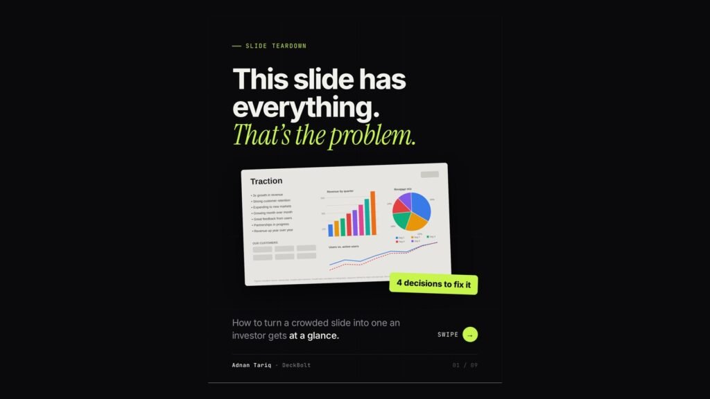
Most decks have a slide like this. It is titled “Traction”. It has seven bullets, three charts competing for space, a row of customer logos and a footnote nobody in the room can read. Everything on it is true. None of it lands.
The problem is not missing information. It is that the slide has not decided what it is trying to say. Here are the four decisions that turn a crowded slide into one an investor understands at a glance.
What is wrong with the “everything” slide
- A title that names a topic, not a point. “Traction” tells people what the slide is about, not what to conclude.
- Three charts competing for attention. Each one is reasonable on its own. Together they cancel each other out.
- Seven bullets saying roughly one thing. Growth, retention, expansion and good feedback are all versions of “we are doing well”.
- Footnotes no one can read. If it matters, it needs to be legible. If it does not, it does not belong on the slide.
Decision 1: Write the headline first
A topic label tells people what the slide is about. A headline tells them what to think. Compare:
- Topic label: Traction
- Headline: Revenue has grown every quarter since launch
Once the headline is a full sentence, everything else on the slide has one job: prove that sentence. That single change makes every other decision easier.
Decision 2: Keep only the chart that proves it
If a chart does not support the headline, it is competing with it. In the example, the quarterly revenue chart proves the headline, so it stays. The revenue mix pie chart moves to the appendix. The users trend line gets its own slide, with its own headline.
Three good charts on one slide read as zero clear ones.
Decision 3: Tell the eye where to land
Colour is a pointer, so use it once. A bar chart with eight colours, gridlines and a legend makes every bar shout. The same chart in neutral grey, with a single accent colour on the latest quarter and a direct label (“Latest quarter, highest yet”), tells the reader exactly where to look and why.
Decision 4: Move the rest. Do not delete it
Cutting something from the slide is not cutting it from the story. Everything you remove has a better home:
- Speaker notes: the context you will say out loud.
- Appendix: the detail for deep-dive questions.
- Follow-up: sources, links and the full model.
The slide keeps one message and one proof. Nothing is lost; it is just in the right place.
Same data, one message
The before and after use exactly the same numbers. The difference is four decisions: a headline that makes a claim, one chart that proves it, one accent that points to the evidence, and a home for everything else.
Run this on any slide
- What is the one sentence? Make it the headline.
- Does every element prove it? If not, it is competing.
- Where does the eye land first? Point it there on purpose.
- What can move? Notes, appendix or follow-up.
Want a second pair of eyes on your deck? Send it over for a free deck review. We will point out the slides that are working against your message, and what we would change first.